

TYPE: Application UI/UX Design
Hikingbook
Product designer: Tiffany Lin
DATE: July 2020-Aug 2021
About
Hikingbook provides innovative solutions to mountain-lovers and builds a fully supportive community for hikers from around the world. Hikingbook believes in safer and more intuitive ways to explore the woods. Our innovative technology takes mountain-lovers around the world to their destinations safely and freely. We build a fully supportive community where hikers from everywhere can share and build connections. Over 30,000 mountain-lovers have trusted Hikingbook as their guide into the mountains, and have recorded over 12,000 hikes from around the world.
I started to collaborate with Hikingbook team as a product designer in July 2020. My main goal was to optimize all the products which represented Hikingbook, including the company's website and mobile application (iOS and Android).
Redesign App

Some problems were discovered after I joined the development of the product. The main reason was they can be noticed during I conducted the product testing. Although some of them were being corrected already, these fragmentary corrections were prone to cause loopholes. After a few times of discussions with my teammates, I stood out my point that I hope to make all the changes simultaneously. Only by sorting them out at once and putting all the issues into comprehensive thinking can do more detailed adjustments.
e.g. the meaning of the icon was not clear enough, the way of displaying the status is too obscure, notifications are constantly popped up when performing tasks, the lack of dynamic interaction to guide the operation... etc. These were not big problems, but they indeed accumulated the obstacles.
Define problems
Since the team did not have enough time to arrange functions comprehensively for the big picture in the early stage of development. Some advanced functions were hidden due to less obvious positions. This greatly reduces the efficiency of the functions.
Firstly, the placement didn't match the layout. Secondly, the lack of classification led to too much information. Thirdly, the complex task was not broken down into multiple simple steps, etc. If the user were not reminded or guided to explore, then it will be difficult for general users to discover. Ultimately, they never use these functions because users couldn't find them. What was sacrificed was the precious time that the team devoted to developing these functions.
-
Improve multiple minor issues
-
Reinforce functions which purpose is not clear enough
-
The use process is not simple and intuitive
-
The current state is not clear
-
Lack of consistent interface and style
Emphasize users' need
We've gotten many opinions about the operation was so complicated, especially for beginners. They were difficult to get started. The operation method of the old Hikingbook was indeed different from the common mountaineering-related apps on the market. Some of the functions developed in the initial stage of the product were designed for meeting a single demand, but when the new functions became more and more diverse, all the processes were not well merged. As a result, the fragmentation of the main process occurred. At the same time, keep causing less intuition and unclarity.
By observing the user experience from the people around me, I analyzed the gap between the product and users. Moreover, as a hiking-lover, I was one of the users as well. Thus I could feel the empathy more sensitively. I implemented user research at the first stage by collecting questionnaires and conducting in-person interviews. Finally converged all the ideas into a few solutions.
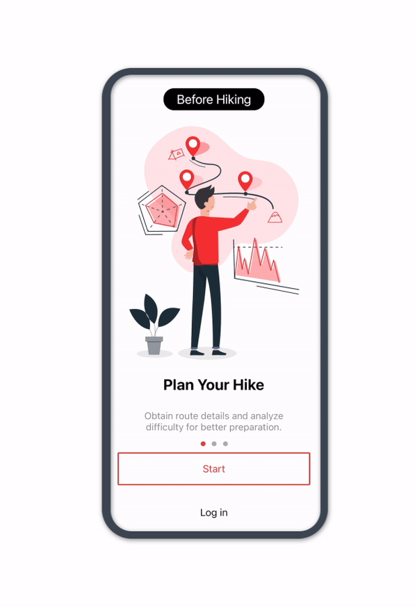
Onboarding Flow
I created the onboarding when the user open Hikingbook for the first time, to let users understand how Hikingbook could help them during hiking. After optimizing the onboarding, this streamlined the process and simplified the main task.
When the user enters a certain page, onboarding smoothly guides the user immediately and the user knows what to do next before pressing a button, rather than having doubts. We tried hard to decrease the confusion and other emotions in the process. Users have a right to be confident to make every decision.
User segmentation
When users sign up for the first time, we ask some basic questions. By doing this, we could categorize user groups so that we could send different information to the target group. In order to increase conversion and fulfill the specific user's demand.

User interface optimization

The new version lets POI be the most apparent part on this screen. Also, I strengthen the clarity of different sections by using background and separator.
The old version lacks hierarchy, thus users hard to find the important feature at a glance.

Showing two posts at one row efficiently reduces the place. Showing the essential information that users care about.
Originally, users could only see two posts at once. Also, the information shown below wasn't meaningful.

Simplified the input section to decrease the pressure of reading.
Displaying a lot of text without arrangement might let users tired to input.

Now, users can easily upload a single record, rather than losing the authority of control.
Before the redesign, the user could only upload all of the records without choosing.

By adding the understandable icon beside the text would help the user be conscious of the meaning.
The old version showed different statuses by only changing the color of the text.
User testing

After many times of internal discussions, all considerations finally converged into the final solution. After that, I've made the lo-fi prototype for pilot testing, then made a hi-fi prototype for user testing. I was responsible for hosting the Usability Test activity. We invited a few respondents to come to our office, and let them try the prototype under our observation. Ultimately, we've truly received users’ voices during the testing. Moreover, this event could verify whether our revised version achieved our goal and user's goal or not.
During the test, we recorded and took notes, trying to capture all the possibilities that might affect the user's behavior. Not only observe the behavior, but also mood changes. I guide the tester to "think out loud" so that we could gain more respondence. Even the tiny reaction was worth listing down on our report. To test the product with fair discipline, I didn't give them any hints during the testing. After testing, I asked them the reason for each step and any hurdle they've encountered. By doing these, I gradually understood the motivation and logic of the users.
This made me clarify that "optimizing products" wasn't the static path to arrive at the destination. Only by continuously observing user behavior, keeping track of user thoughts, and maintaining the quality of the product could have more opportunities to make better products. In the end, fulfilling users' needs while they also feel satisfied.
Reflection
From discovering problems, researching users, thinking about solutions, doing tests, and finally making all adjustments according to the needs. It took about half a year for the team to complete. For us, it was a long-term battle of love and hatred. Sometimes we did have disagreements with each other, yet we were always keen to discuss with rational opinion and try to reach that consensus. However, as we deep into the discussion, we could give each other real opinions and constantly inspired new ideas. The more stalemate the situation, in return it will become a stepping stone for diligence.
Through design collaboration, it also proved that these design ideas were not just the imagination of the designer. When the teams questioned each other and point out different problems, it meant that everyone had a high expectation for our products. Even there was always happen some resistance in development. I also try to achieve transparent communication, so that I could avoid some problems in the design process, also increase the sensitivity of timely correction of the direction, and finally reach the best balance with the development department.
As product designers, we often need to think from the perspective of users and act toward the direction of corporate goals. Sometimes it is really difficult to achieve a win-win situation. After I went through this revision process, I realized user experience design wasn't chasing "perfect". We will always produce different results from different angles, depending on how you maintain your original goals while trying your best to satisfy the current market.
Users are affected by the trend of generations at any time, and it is impossible to stay the same look. We who are responsible for developing products must also act dynamically to follow the trend, and create a product which everyone wants to own that.
Hikingbook in Taiwan
Nowadays, Hikingbook become more and more popular in Taiwan. In Taiwan, Hikingbook is now ranking 14th with an over 9.5k rating. According to the Google analysis, users increased about 20-30% after the new version had been released, and Monthly Active User(MAU) also had an incremental growth. I was so grateful that I had the chance to realize my idea into the product, which helped numerous hikers from all over the world.
